Sign Design: How to Create Business Signage That Actually Works
A marketing director at a regional hospital system recently reviewed signage across twelve of the system’s outpatient facilities as part of a brand consistency audit. What she found was a case study in uncoordinated design decisions made over fifteen years: different typefaces across different facilities, the system’s logo reproduced at different sizes and sometimes different colors, donor recognition walls in three different visual styles, and exterior monument signs from two different generations of brand standards that no longer matched each other. No single decision had been wrong on its own – each sign had been ordered to solve a specific problem at a specific time. The accumulated result was a visual environment that communicated a brand managing its identity inconsistently rather than one with a clear, unified presence. The design review process that followed wasn’t primarily about aesthetic preferences. It was about defining the principles that make business signage actually work – principles this guide covers from the beginning.
What Makes Business Sign Design Effective
Effective sign design is often described in aesthetic terms – clean, bold, legible, distinctive – but these descriptions don’t capture the underlying principles that make those qualities produce better results in the real world. Understanding the actual principles allows better design decisions at every stage, from briefing a designer to reviewing a proof.
Design and signs that work share a common underlying logic: they solve a specific communication problem at a specific viewing condition. Every sign has a viewer, a viewing distance, a viewing duration, and a viewing context, and effective sign design optimizes for the specific combination of these variables that applies to the actual sign being produced. A sign designed without reference to viewing distance and duration – essentially, designed to look good on a computer screen – frequently fails to perform at the actual installation location, either because the text is too small to read at distance, the color contrast is insufficient in the ambient lighting of the space, or the information hierarchy doesn’t match the sequence in which viewers actually process it.
Design of sign hierarchy is the principle that the most important information is most prominent, and everything else is subordinate to it. For most business identification signs, the most important information is the business name – which is why the business name should dominate the sign’s visual composition. Secondary information (tagline, address, website, hours) should be visibly subordinate: smaller, lighter, or positioned in a secondary visual zone. Signs that treat all information with equal visual prominence force the viewer to do the prioritization work that the designer should have done, and viewers at typical sign viewing speeds rarely complete that work before their attention has moved on.
Signs for business near me that generate walk-in traffic from passersby are competing for a few seconds of visual attention from people who are moving, may be distracted, and have no particular reason to look at any specific sign. This attention constraint is the design constraint that matters most in high-traffic business signage: every design decision should be evaluated by asking whether it aids or hinders communication in the two to three seconds of attention a passing viewer is likely to offer.
Sign companies near me that produce consistently strong work design for their actual viewer, not for their portfolio. The distinction matters because design presentations – how a sign looks in a rendered proof or in a photograph – are optimized for careful examination at close range, exactly the opposite of the conditions under which most business signs are actually read. A design decision that reads beautifully in a proof can fail at the installed scale and viewing distance, and catching this mismatch during proof review rather than after installation requires specifically evaluating the proof against the actual installation conditions.
Typography, Color, and Contrast: The Three Pillars of Sign Legibility
Legibility – the ease with which text on a sign can be identified and read – is the primary design quality that determines whether a sign performs its communication function. Legibility is determined primarily by three factors: typeface selection, color contrast, and letter sizing relative to viewing distance.
Typeface selection for business signs should prioritize legibility over distinctiveness. The sign industry has consistently validated that sans-serif typefaces with open, unambiguous letterforms – where letters like “I,” “l,” and “1” are clearly distinguishable, and where rounded letters like “C,” “G,” and “O” have clear openings – perform better than more decorative or condensed alternatives at the viewing distances and durations typical of business signage. This doesn’t mean every business sign should use generic sans-serif type; it means that when distinctive brand typefaces are used for identification signage, their legibility characteristics need to be specifically evaluated, and adjustments made if specific letterforms create ambiguity at scale or distance.
Color contrast between the sign’s primary text and its background directly determines legibility, particularly in variable or challenging lighting conditions. Maximum contrast (black text on white background or white text on dark background) provides the most reliable legibility across lighting conditions. Lower-contrast combinations – dark gray on medium gray, light blue on white, gold on cream – may look sophisticated in a design presentation but fail at the legibility task in practice, particularly in overcast or transitional lighting conditions or when the sign has aged and lost some of its original color saturation.
Letter sizing should be determined by viewing distance and traffic speed, not by what fills the available sign space attractively. As covered in the exterior business signs guide for this site, each inch of letter height provides approximately ten feet of comfortable reading distance. A sign with a 6-foot available width may be able to accommodate very large letters, but if the viewing distance is 150 feet, the appropriate letter height is 15 inches or more – a specification that should drive the layout rather than what looks proportional in a design proof at screen size.
Common Sign Design Mistakes and How to Avoid Them
Too much information on a single sign is the most common design mistake in business signage, and it’s almost always driven by the client’s desire to communicate everything rather than the designer’s judgment about what can actually be communicated at the viewing conditions of the specific installation. A sign that attempts to communicate the business name, tagline, address, website, phone number, and service list in a single panel readable at 50 feet from a moving vehicle will successfully communicate none of these things – because the letter sizes required to fit all of that information into one sign at a readable viewing angle are too small to read at that distance. The practical solution is a clear information hierarchy with one or two primary communication goals per sign, and separate signage for secondary information (window graphics for website and phone, separate directional sign for address detail).
Inconsistent design across multiple sign locations produces the fragmented brand identity described in the hospital system audit. Inconsistency is usually the accumulated result of incremental decisions made without reference to a documented standard – a sign ordered to solve an immediate problem, using whatever typeface the printer suggested, in a color that was close to but not exactly the brand color. Over time, these individually reasonable decisions produce an incoherent visual environment. The solution is a written sign standards document that specifies exact colors (Pantone references, not “blue”), approved typefaces, logo size and position rules for each sign format, and approved materials – and a process for reviewing every sign order against that standard before production.
Proof approval without checking at-scale legibility is a process error that causes many otherwise well-designed signs to underperform in installation. Proofs are typically presented at screen size or printed at A4/letter size – dramatically smaller than the actual installed sign. Letter sizes that look appropriate at screen scale can be unexpectedly small when the sign is installed at full scale and viewed from the actual installation distance. The most reliable way to catch this before fabrication is to request a proof that shows the sign at its actual scale against a photo of the installation location, or to request a sample of the primary typeface at the specified size printed at 1:1 scale for physical evaluation.

Working With a Sign Designer or Sign Company on Design
The design process for business signage works best when it’s genuinely collaborative – the client brings the brand knowledge and communication objectives, and the sign professional brings the production knowledge and viewing-condition experience. The breakdown that produces mediocre results usually happens when either side assumes the other’s expertise without actually engaging it.
Sign company near me design consultations are most productive when the client brings: a vector logo file in the brand’s approved colors; a clear statement of the sign’s primary communication goal (what should a viewer take away in three seconds?); a description of the viewing context (distance, speed, ambient lighting, time of day the sign is most heavily used); and any existing brand standards documents. These inputs give the sign designer the context they need to make informed recommendations rather than producing generic layouts that may not fit the actual communication challenge.
Design and signs feedback at the proof stage should focus on functional criteria – is the primary information clearly dominant, is the color contrast sufficient for the likely lighting conditions, are the letter sizes appropriate for the viewing distance – before aesthetic preferences. Aesthetic feedback is legitimate, but it should come after functional criteria are confirmed rather than instead of them.
Sign company near me selection for design-intensive projects should include evaluation of the company’s design portfolio specifically: do their completed installations communicate clearly at installation scale, or do they show a tendency toward designs that look good in presentation but sacrifice legibility for aesthetic appeal? This evaluation requires looking at photographs taken at actual viewing distance rather than close-up photography of finished signs.
Conclusion
The honest takeaway on business sign design is that effectiveness is almost always a function of discipline rather than creativity. The designs that perform best in installed conditions are the ones where someone made a clear decision about the single most important thing the sign needs to communicate, specified the letter size that makes that information readable at the actual viewing distance, chose color contrast for the actual lighting conditions rather than the design presentation, and resisted the temptation to include more information than the viewing context can support. That discipline – applied consistently across every sign in a system – is what produces the visual environment the hospital marketing director was working to rebuild, and what makes the difference between signage that works and signage that simply exists.
Frequently Asked Questions
What makes a business sign design effective?
Effective sign design solves a specific communication problem at a specific viewing condition: the right information, in the right hierarchy, at the right size for the viewing distance, with sufficient color contrast for the ambient lighting. Signs that fail typically do so because one of these variables wasn’t considered during design – the viewing distance wasn’t factored into letter sizing, the color contrast was chosen for aesthetics rather than legibility, or too much information was attempted at a scale where only primary information can be effectively communicated.
What typefaces work best for business signs?
Sans-serif typefaces with open, unambiguous letterforms consistently outperform decorative, condensed, or script alternatives in legibility testing at typical sign viewing distances and durations. This doesn’t prohibit brand typefaces in signage, but it means that when distinctive brand fonts are used, their specific legibility characteristics at scale and distance should be evaluated during the design process rather than assumed to perform acceptably because they look good at screen size.
How many pieces of information can a sign communicate effectively?
One primary piece of information (the business name or key message) should dominate every sign’s visual composition. One to two secondary pieces of information can be included in a clearly subordinate visual position. Beyond this, additional information should be on separate signs designed for the specific viewing conditions appropriate to that information (window graphics for close-range detail, directional signs for location-specific guidance). A sign that attempts to communicate five or more pieces of information at vehicle-speed viewing conditions will effectively communicate none of them.
How do I ensure consistent sign design across multiple locations?
Develop a written sign standards document specifying exact brand colors (by Pantone reference), approved typefaces, logo size and position rules for each sign format, and approved materials for each sign application. Review every sign order against this standard before approving production. Designate a single person or team responsible for sign standards compliance across all locations. This process costs relatively little beyond the initial standards document development and prevents the accumulated inconsistency that emerges when each location orders signs independently without coordination.
Read more

Foam Routed Signs and CNC-Cut Signage: When and Why Businesses Choose This Format

Hanging Signs for Trade Show Booths: Weight, Rigging, and Sightlines That Work
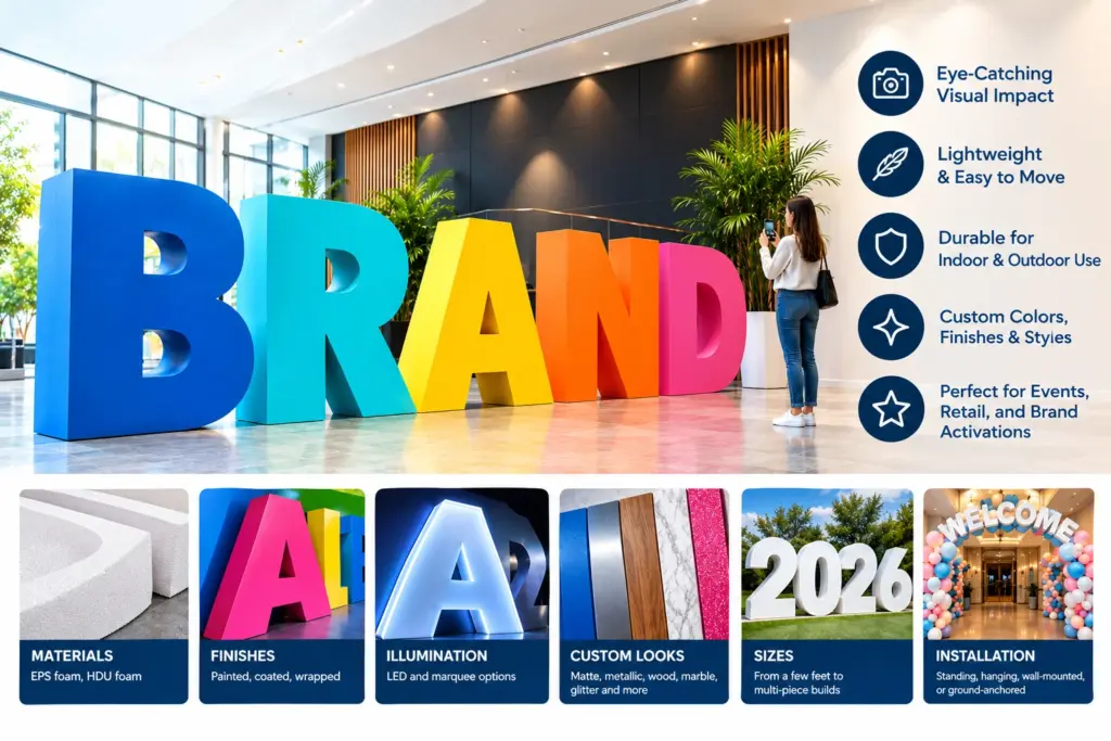
Oversized Foam Letters for Events, Retail Displays, and Brand Activations
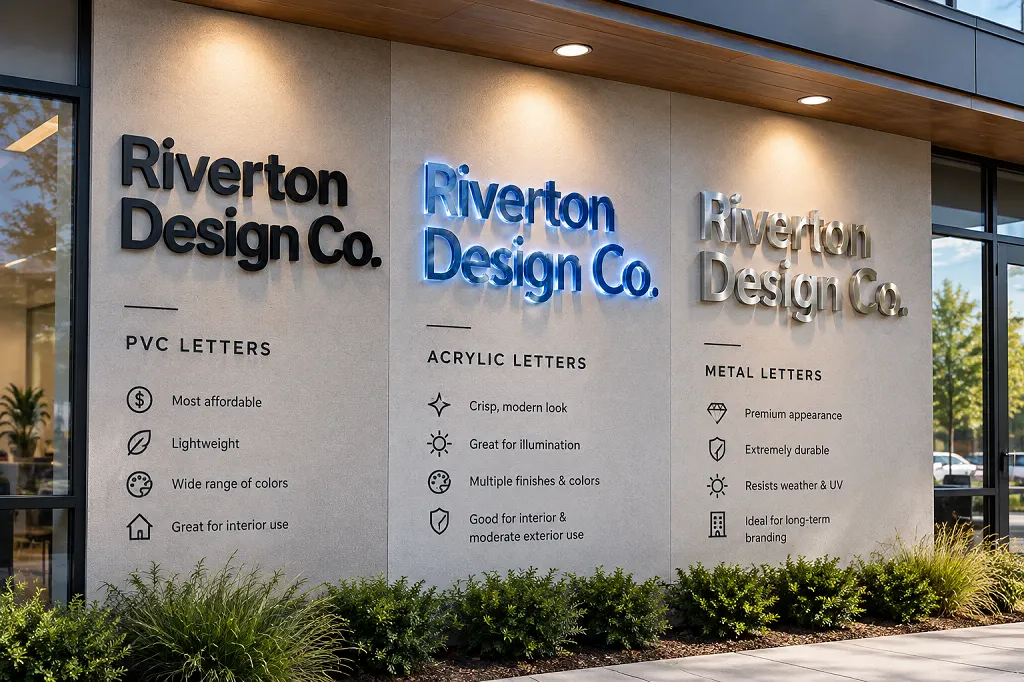
PVC, Acrylic, or Small Metal Letters: Choosing the Right Dimensional Letters for Your Storefront

Foam Sculptures and Oversized Product Replicas: How Brands Build Unmissable Experiential Marketing

How Backlit and Halo-Lit Signs Turn a Storefront Into a Landmark After Dark
Digital Signage for Business: What It Is and How to Use It Effectively
Sandblasted and V-Carved Signs: The Craft Behind Timeless, Hand-Finished Business Signage

Floating Pool Letters: A Fresh Way to Brand Pool Parties, Resorts, and Brand Activations

Premium 3D Dimensional Signage with Professional Lighting Solutions
Safety and Warning Signs for the Workplace: A Complete Guide for Business Owners
Massive 3D Dimensional Signage That Commands Attention
Recommended Articles
Foam Routed Signs and CNC-Cut Signage: When and Why Businesses Choose This Format
Hanging Signs for Trade Show Booths: Weight, Rigging, and Sightlines That Work
Oversized Foam Letters for Events, Retail Displays, and Brand Activations
PVC, Acrylic, or Small Metal Letters: Choosing the Right Dimensional Letters for Your Storefront
Foam Sculptures and Oversized Product Replicas: How Brands Build Unmissable Experiential Marketing
How Backlit and Halo-Lit Signs Turn a Storefront Into a Landmark After Dark