ADA Compliant Signs: Requirements, Types, and Installation Guide for Commercial Buildings
A property manager overseeing a recently renovated office building received a complaint from a visually impaired tenant during the first month of occupancy: the new wayfinding signs throughout the building were beautifully designed and clearly installed, but none of them had Braille or raised character elements. The building had passed final inspection with the new signs in place, but a subsequent accessibility audit revealed that the signage system didn’t meet ADA requirements – and the property was now exposed to a potential compliance complaint. The signs had to be replaced, at significant cost, with compliant versions. ADA signs – signs meeting the accessibility requirements of the Americans with Disabilities Act – are a regulatory requirement for commercial buildings, not an optional feature, and getting them right from the initial installation avoids exactly the outcome that building’s property manager experienced. This guide covers the requirements, the sign types they apply to, and how to specify and install compliant signage correctly.
What ADA Signage Requirements Cover
Americans with Disabilities act signage requirements govern specific aspects of how certain signs in commercial and public buildings must be designed and installed to be usable by people with visual impairments. Understanding which signs are covered by ADA requirements – and which aren’t – is the starting point for any commercial building signage project.
ADA signs requirements apply specifically to signs that identify permanent rooms and spaces within a facility – room and space identification signs such as restroom signs, room number signs, office identification signs, and signs identifying permanent functional spaces (conference rooms, stairwells, elevator lobbies, and similar). These are called “permanent room and space signs” in ADA terminology, and they must comply with specific character, braille, and mounting requirements.
Ada signage requirements do not apply to overhead hanging signs, temporary signs, directory signs, building directories, or signs that display information that changes frequently (menu boards, departure boards, and similar changeable-content signs). These are subject to other accessibility considerations but not to the specific ADA room and space sign requirements that mandate raised characters and Braille.
Restroom signs are the most widely recognized ADA-required sign category, and restroom sign compliance is the most frequently inspected. Restroom signs must use raised characters, include Grade 2 Braille below the raised text, use pictograms (the standard male, female, or unisex figures on appropriate background panels), meet specific color contrast requirements, and be mounted at a specific height on the latch side of the door – 60 inches above the finished floor to the centerline of the sign. Getting any of these requirements wrong produces a non-compliant installation that is potentially subject to ADA enforcement.
ADA sign design requirements include: raised characters (letters and numbers must be raised 1/32 inch minimum from the sign face), Grade 2 Braille below each line of raised text, sans-serif typeface, character height between 5/8 inch and 2 inches for most applications, specific stroke width proportions, specific character spacing, and color contrast between the characters and the sign background of at least 70% (light-on-dark or dark-on-light). These aren’t suggestions – they’re regulatory minimums, and signs that don’t meet them are non-compliant regardless of how they were specified.

Types of ADA Signs Required in Commercial Buildings
Ada signs in commercial buildings fall into several distinct categories based on the type of space they identify and their specific placement requirements.
Restroom signs are required at all permanent restroom facilities in commercial buildings, including multi-user restrooms, single-user restrooms, and family restrooms. They must include the appropriate pictogram (male figure, female figure, or both for unisex facilities), raised characters for the room name, Grade 2 Braille, and must be mounted on the wall on the latch side of the door at the specified height. These requirements apply in addition to any larger overhead or illuminated restroom identification signs – the overhead signs don’t satisfy the ADA tactile sign requirement.
Room number and office identification signs are required wherever rooms and spaces are identified with permanent numbers or names that help occupants and visitors navigate the building. Conference room signs, office suite identification signs, and similar permanent room identifiers must meet the same raised character and Braille requirements as restroom signs and must be mounted in the same latch-side position at 60 inches above finished floor. In multi-tenant office buildings, these typically include both the room number and the tenant name, with both elements meeting character and Braille requirements.
Stairwell identification signs at each floor level in stairwells – identifying which floor the exit door opens to – are required and must meet ADA requirements. These are frequently overlooked in building signage planning, particularly during renovations where stairwell signage may not be included in the primary sign program scope.
Elevator identification signs at each floor’s elevator lobby, indicating the floor level, are also required to meet ADA standards and must include raised characters and Braille. These small floor-level indicator signs are another frequently missed requirement in multi-story building signage programs.
Accessible route signs identifying accessible paths, parking spaces, and building entrances must comply with specific requirements regarding the International Symbol of Accessibility (the wheelchair symbol), its display size and contrast, and its mounting location relative to the facilities it identifies.
Specifying and Installing ADA Compliant Signs
Ada sign specification should be confirmed against the current ADA Standards for Accessible Design – specifically the 2010 ADA Standards, which are the current federal standard – and against any state or local accessibility requirements that may be more stringent than the federal minimum. California, for instance, has California Building Code accessibility requirements that exceed the federal ADA minimums in several specifics, and buildings in California that meet ADA minimums may still be non-compliant with state requirements.
Sign manufacturers producing ADA-compliant products test their products against the regulatory requirements and can provide compliance documentation. Purchasing from a manufacturer who provides written compliance documentation for each product type, rather than simply asserting their products are “ADA compliant,” provides better protection against the kind of compliance failure the property manager in the opening scenario experienced.
Material selection for ADA signs should prioritize durability and the maintained contrast required for visual accessibility. Raised characters that are the same material as the sign face but differentiated by color can develop reduced contrast contrast over time as the sign ages and the finish wears; raised characters in a material with inherent color contrast (dark characters on a light field, or vice versa, as separate material elements) maintain their visual contrast through the sign’s lifespan more reliably.
Installation height and position are as critical as sign content and design for ADA compliance. The 60-inch centerline height above finished floor is an absolute requirement, not a guideline, and signs installed at different heights – even by small amounts – are technically non-compliant. For buildings with raised flooring, accessible flooring, or other floor treatments that change the finished floor height from the structural floor height, the centerline measurement must be taken from the actual finished floor surface at the sign location. Mounting location on the latch side of the door is equally absolute – signs installed on the hinge side or directly on the door itself do not satisfy ADA requirements regardless of their design compliance.
Conclusion
The honest takeaway on ADA compliant signs is that compliance is non-negotiable and the consequences of getting it wrong are significantly more expensive than getting it right from the start. The property manager’s experience in this article’s opening scenario is not unusual – it’s the predictable result of a sign specification process that treated accessibility requirements as a secondary consideration rather than a primary one. ADA requirements for commercial building signs are well-documented, the compliant products are widely available from established manufacturers who provide compliance documentation, and the installation requirements are specific enough to verify during inspection rather than discover later through a complaint. Treat ADA signage as a design constraint that applies from the beginning of the sign specification process, not as a compliance check applied at the end, and the outcome will be a building that serves all its occupants appropriately and avoids the exposure that comes from non-compliance.
Read more

Foam Routed Signs and CNC-Cut Signage: When and Why Businesses Choose This Format

Hanging Signs for Trade Show Booths: Weight, Rigging, and Sightlines That Work

Oversized Foam Letters for Events, Retail Displays, and Brand Activations
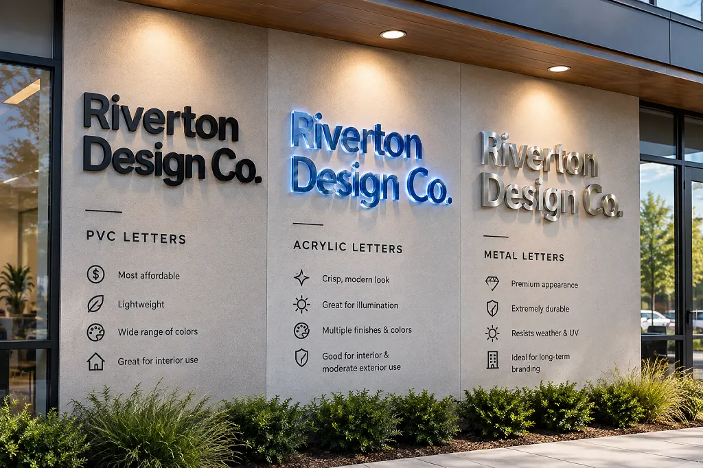
PVC, Acrylic, or Small Metal Letters: Choosing the Right Dimensional Letters for Your Storefront

Foam Sculptures and Oversized Product Replicas: How Brands Build Unmissable Experiential Marketing

How Backlit and Halo-Lit Signs Turn a Storefront Into a Landmark After Dark
Digital Signage for Business: What It Is and How to Use It Effectively
Sandblasted and V-Carved Signs: The Craft Behind Timeless, Hand-Finished Business Signage

Floating Pool Letters: A Fresh Way to Brand Pool Parties, Resorts, and Brand Activations

Premium 3D Dimensional Signage with Professional Lighting Solutions
Safety and Warning Signs for the Workplace: A Complete Guide for Business Owners
Massive 3D Dimensional Signage That Commands Attention
Recommended Articles
Foam Routed Signs and CNC-Cut Signage: When and Why Businesses Choose This Format
Hanging Signs for Trade Show Booths: Weight, Rigging, and Sightlines That Work
Oversized Foam Letters for Events, Retail Displays, and Brand Activations
PVC, Acrylic, or Small Metal Letters: Choosing the Right Dimensional Letters for Your Storefront
Foam Sculptures and Oversized Product Replicas: How Brands Build Unmissable Experiential Marketing
How Backlit and Halo-Lit Signs Turn a Storefront Into a Landmark After Dark